


Fultrek: Redesigning a Trail Guide for Every Hiker
A mobile app built to simplify outdoor discovery—offering a smooth, intuitive way to explore local trails and plan hikes with ease. The experience blends functional clarity, visual calm, and thoughtful design to help users feel confident, curious, and connected to nature.
Role
UX/UI Designer
Industry
Outdoor Recreation
Duration
3 months
Discover
Comparative Analysis
To better understand the competitive landscape, I analyzed three key apps:
Actionbound – location-based scavenger hunt app
Pokémon GO – gamified exploration using AR and real-world navigation
AllTrails – leading app for discovering and navigating hiking trails
These insights helped identify effective patterns and gaps—shaping Fultrek’s feature set and user experience strategy.
User Research
Methods used:
Survey via SurveyMonkey
User interviews (1:1 format)
Shared across Facebook, Reddit, and Meetup hiking groups
Process:
Developed survey questions based on competitive analysis findings
Reached out to communities to gather a diverse range of hiking habits and preferences
Wrote and used a script to guide semi-structured interviews with active hikers
This mixed-method approach provided both quantitative data and qualitative insights—laying a strong foundation for feature prioritization and user-centered design.
Affinity Mapping
To analyze user testing feedback, I followed a structured process:
🎙️ Recorded all sessions (with participant consent)
📝 Transcribed audio using Temi for fast, accurate note-taking
🧩 Organized quotes and observations into an affinity diagram
This helped me cluster insights by theme—revealing patterns, pain points, and opportunities that directly informed design decisions.
Defining the Problem
Initial Challenge:
Casual hikers often struggle to easily find and choose trails.
Problem Statement:
"Casual hikers and travelers need an easy way to search for trails. I will know this to be true when I see an increase in hikers signing up, downloading maps, and posting photos."
🧭 Incentivized Trail Discovery
Hikers earn points by:
• Reaching set destinations
• Taking and sharing trail photosPoints can be redeemed for:
• A free drink or small appetizer at local restaurantsBenefits:
• Creates a memorable, shareable experience
• Supports small businesses
💡 Ad-Supported Map Access
Show a local ad before map download
Creates a revenue stream
Keeps the app free for users, with no premium paywall
Ideation & Opportunities
Encourage exploration and engagement through gamification:
How it works:
• Reach set destinations
• Take and share trail photos
• Earn pointsRedeemable rewards:
• Free drink or small appetizer at local restaurantsWhy it matters:
• Creates a memorable experience
• Builds community
• Supports small businesses
💡 Ad-Supported Map Access
Monetization that keeps the core experience free:
How it works:
• Show a location-based ad before map downloadBenefits:
• Generates revenue
• Keeps the app free—no premium paywall
Understand
User Journeys
Based on user goals, needs, and pain points, I created task scenarios to better empathize with the personas’ experience.
What I Did:
Mapped out a typical journey based on real user data
Captured each thought, feeling, and action throughout the process
Aligned each step with specific pain points or moments of delight
Outcome:
Uncovered key opportunities for improvement
Identified ways to reduce friction and enhance the overall trail-finding experience
Design
User Flows
To visualize the app’s structure and key decision points, I created user flow charts based on:
Defined task scenarios
User goals and behaviors
Core features and screens
These flows helped clarify the information architecture and guided early wireframes and navigation design.
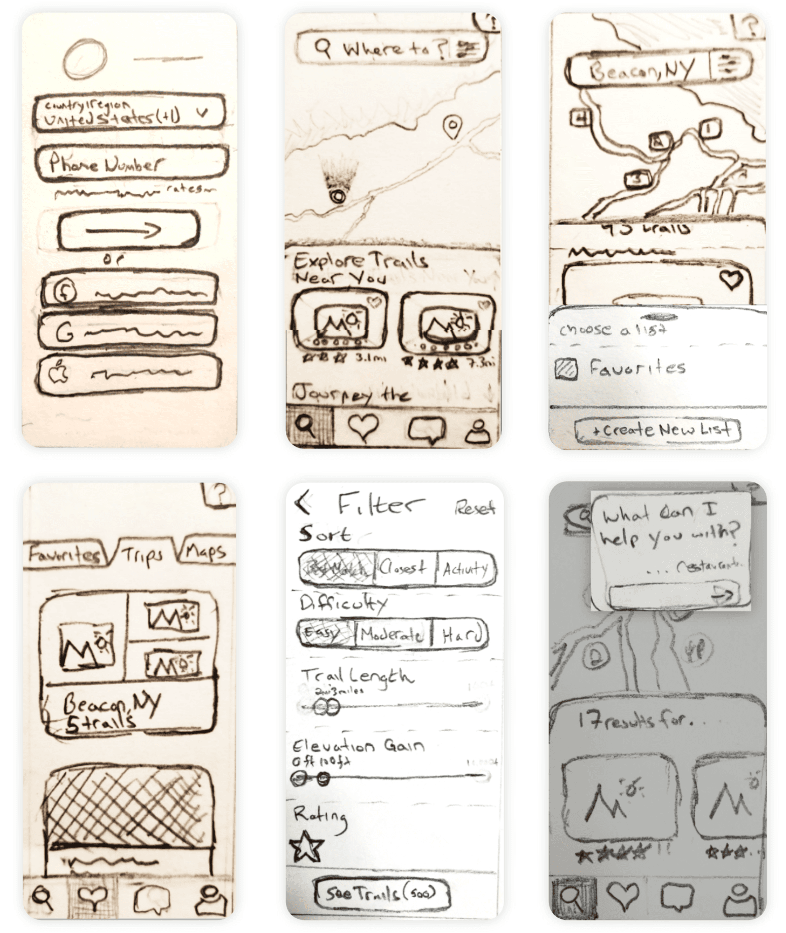
Low Fidelity Wireframes
To visualize the user flow, I began with quick, low-fidelity sketches:
✏️ Sketched early screens to map layout and interactions
🤝 Shared with team and users for early feedback
🔁 Iterated quickly—allowing for key changes while costs stayed low
These wireframes helped validate structure and usability before moving into high-fidelity design.
Mid Fidelity Wireframes
I transitioned from sketches to mid-fidelity wireframes using Adobe XD:
🔗 Connected components and screens to simulate real interactions
🧪 Conducted quick user tests to observe usability and gather feedback
🔄 Iterated based on insights to refine layout, flow, and functionality
This phase helped validate design decisions before committing to high-fidelity visuals.
Branding
I crafted a visual identity that aligns with Fultrek’s purpose: inspiring outdoor exploration while staying grounded in clarity and simplicity.
🎨 Brand Goals
Reflect the natural world through color, tone, and shape
Maintain a clean, modern aesthetic that complements the app’s usability
Create a visual system that feels inviting, trustworthy, and motivating
🏞️ Key Elements
Color palette: Earthy greens and calming neutrals evoke nature and ease
Typography: Clear, friendly type for legibility on the trail
Logo: A mountain-inspired mark symbolizing direction and discovery
The brand reinforces the product’s mission—making the outdoors feel more accessible, engaging, and rewarding for every hiker.
Logo Design
The Fultrek logo was inspired by the letter “F” and the silhouette of a trailhead or peak—a subtle nod to exploration and movement.
✏️ Sketched by hand using pencil and graph paper to explore form
💻 Refined in Adobe Illustrator for precision and scalability
🎯 Designed to be simple, recognizable, and versatile across screen sizes
The final mark captures the brand’s spirit—adventurous yet approachable, modern yet rooted in nature.
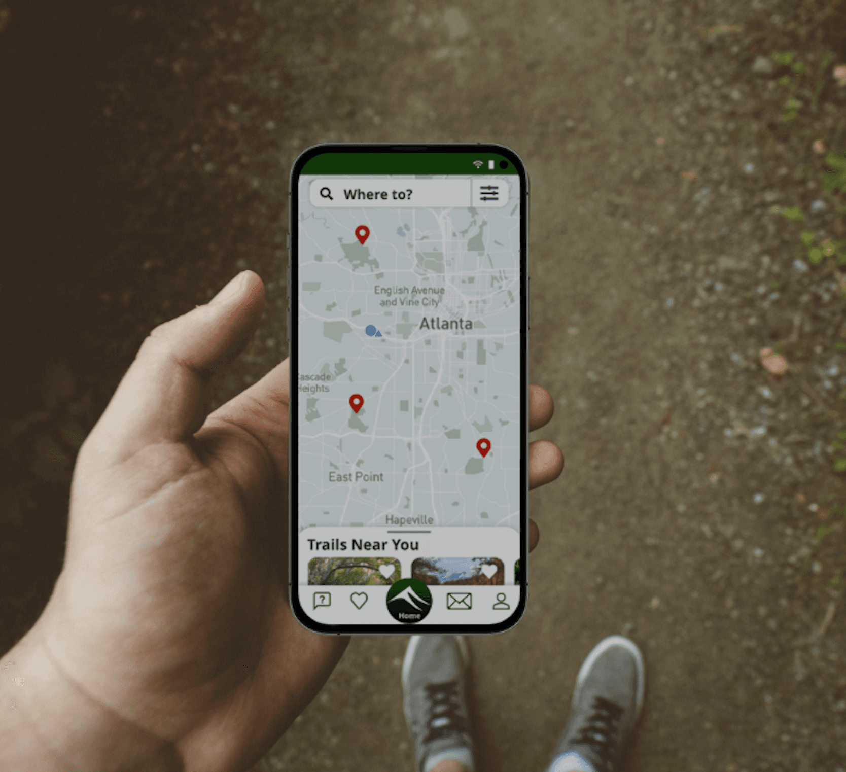
High Fidelity Wireframes
I translated the mid-fidelity designs into fully polished high-fidelity wireframes:
🎨 Applied branding elements like color, typography, and iconography
🧭 Refined layout and hierarchy for smoother user flows
📱 Designed for mobile-first with responsiveness across devices
These wireframes closely reflected the final product and were used to build interactive prototypes for usability testing and stakeholder feedback.
Fultrek Walkthrough
Final Thoughts
Designing Fultrek gave me the opportunity to explore how technology can enhance real-world experiences—helping users feel more connected to both nature and each other. Through research, testing, and iteration, I created a product that balances clarity, motivation, and delight in the outdoors.
This project sharpened my ability to design for exploration, apply user insights in meaningful ways, and think critically about how incentives and local partnerships can shape digital behavior. Most importantly, it reminded me that great design doesn’t just solve problems—it encourages people to step outside and experience something new.